Thousands of fonts, colors, and other typographic elements we see daily either on paper or smart devices. Psychologists strongly believe that these fonts and typographies affect human behavior and emotions. Its psychology is the visual and emotional reaction of the viewer towards it, hence it plays an important role in web and app designing.
Since a well-chosen font and typeface impact the user experience, web designers have specifically started studying stemming from psychology and behavioral science to make webpages more effective. So, let’s take a look at how they do it.
Thick and Thin Fonts
Thick and thin typefaces are called bold and light, and they both have an impact on user experience and the overall tone of the page.
This is perceived as elegant and sophisticated. They convey lightness and subtlety. However, they are also more difficult to read, especially on small devices. That’s why they are not used in the body text, but in headings and for emphasizing a point.
Thickness can convey a sense of strength, stability, and confidence. They are used to highlight text that is supposed to stand out on a page. Nevertheless, too many bold typefaces can be overwhelming and feel cluttered.
What’s a Serif Font and How It’s Used?
The two common fonts – are serif and sans-serif. First, the serif font is the one with a small curve at the end of each letter. They are generally used in printing materials and web designs where the page contains a lot of text. These curves make it easier for readers to go ahead from one letter to another.
While the sans-serif doesn’t have any curls at the end making them a bit difficult to read, however, they give texts a more ornate and minimalistic look.
Though choosing between these two, totally depends on the requirements and overall tone of the website, serif fonts are best utilized for traditional web pages, and sans-serif fonts are considered suitable for minimalistic sites with a stylish interface.
Use Typography to Draw Attention
In a page designing process, picking typefaces is one of the crucial elements. It gathers the attention of the viewer to an item without breaking its flow. So, selecting a fine branding agency for web design becomes pivotal. For example, if you’re a company based in Atlanta, you can go for a good Atlanta branding services agency that will help you choose a good topography for your organization.
Just like, italicizing a word makes it stand out of the paragraph or text regardless of what print type you have chosen, a piece of professional advice will aid in electing a font that will align best with your brand identity and creates a unique user experience.
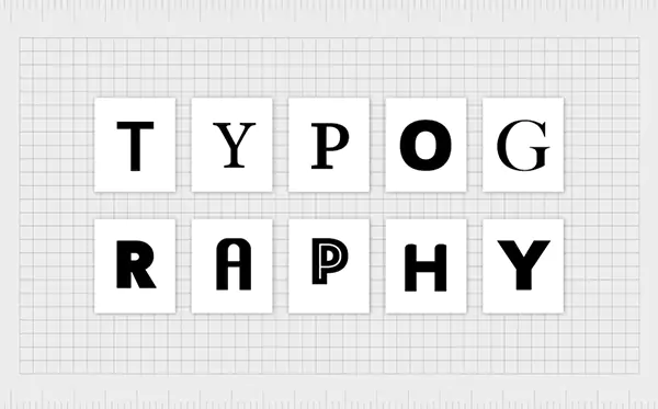
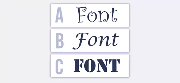
Uppercase and Lowercase Fonts
Lowercase fonts are often associated with compassion and innovation. Companies that want to portray themselves as “caregivers” or as companies that create innovative products often convey this using lowercase in their website design.
On the other hand, uppercase typefaces are associated with the concept of power. They convey energy, strength, and success. In most cases, uppercase fonts are used only for company names and logos and not throughout the text on a page.
Use Font Hierarchy to Make the Website More Readable
One of the simplest elements of composition design – font size – can be the most effective in reaching the audience.
They are used for headlines and sub-headlines, but they can also be sprinkled throughout the website layout. This increases readability and provides a sense of structure.
They can be used for more than just headlines and manipulating text. For example, “call to action” buttons also need to be emphasized so that the reader’s eye is drawn to the text right away. The font used on these buttons should create an inviting aesthetic.
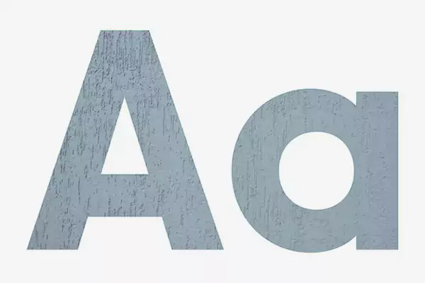
Rounded vs. Angular Fonts
They possess many unique traits that have a psychological effect on the reader, even though they appear small and insignificant.
Rounded fonts are usually more popular than sharp ones. Sharp shapes convey danger and masculinity. On the other hand, rounded fonts are more welcoming and friendly. This doesn’t mean that there’s no use for a “dangerous” font. It draws attention, and it conveys a sense of urgency as well.
Colors Add Another Layer to the Effect
Psychologists have also been studying the effects of colors, and this research affects web design as well as typography.
There are a few goals to incorporate when choosing the proper scheme. This includes making the site accessible to all users, being on brand, and using colors to connote mood and emotions.
A few examples of how colors can be used to set the tone and establish a mood include:
- Red expresses excitement, passion, and urgency. It can also connote danger and aggression.
- Orange is a warm and friendly color, and it’s associated with enthusiasm.
- Green connotes nature, health, and growth. It also represents money and wealth.
- Blue is a calming and reassuring color. It invokes a sense of stability and order.
- Purple is a luxurious and regal color. It’s seen as a sophisticated and elegant choice, and it works best when used sparingly.
- Gray is neutral and balanced. This color works best with a minimalistic design.
To Sum Things Up
Typefaces can convey emotions, and moods and cause a reaction and even a bond with the reader. The psychology of typography has been studied for a long time, and it still yields both scientific and practical innovations in the field of design.
It can carry an aesthetic or a mood, and it can guide the reader and entice them to take action. It also should be a part of an overall brand – a statement about the values behind the design.
As part of the process of utilizing composition to create a compelling brand image, you can explain your ideas to the Highline Tech, what you have in mind – they can help translate your vision into a font and color scheme that resonates with your audience and enhances your brand’s appeal.
In the end, the choice of color is equally important, and it should complement the typography and the fonts in creating an aesthetic.