
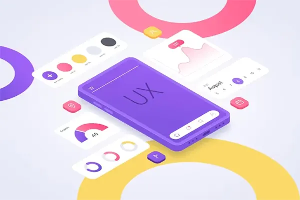
The user experience (UX) refers to the way a user feels when they are using a product, service, or software. Since it sets the heart of the website design principle, it goes hand in hand with creating appealing designs and systems for the customers.
A good UX designer understands how to design a website that will spread your business through word-of-mouth and promote your business, which is considered the best advertising. Talking about the ROI of good UX, it’s limitless because there will be so many customers referring or recommending your app, contributing to creating a positive feedback loop.
Since UX and UI are such a significant element, let’s understand how to optimize the mobile user experience for your customers.
User Experience: What It Means and Why It’s Important?

When a customer interacts with your brand, UX is the only thing they feel. From the point they first realize you exist to filling out surveys after using your product, everything should be clear and easy to use.
Here, learning about the customer journey maps is helpful to focus on particular touchpoints instead of the whole thing. For example, if you are considering a UX engineer to help you design your software and application design, you may have to face a new bucket of problems.
So, once you have understood how a customer interacts with your website, you will be able to effectively advertise and sell your products in the future.
Besides this, you must not miss mobile apps because they are mostly used by customers to interact with companies. Put some effort into understanding the benefits of mobile data optimization. Therefore, having an app with a compelling UX can set you apart from your competitors.
UX and UI: Similar, But Not the Same

It’s very common to perceive user experience and UI as the same, but they are not. UI i.e., a user interface is a result of style, design element, and ease of use for your site or app. It focuses on the elements that the customer interacts with your software, site, or app.
On the other hand, UX is all about the experience, including the entire customer journey from beginning to end. So, you can also say that UI is a part of UX, but vice versa is not true.
What are the Differences Between Designing Desktop and Mobile UX?
Since, people can use the applications in shorter bursts, whereas laptops or desktops for long periods. That’s why developing a mobile version of your website may require doing complete rework to save customers time so they won’t switch to a faster competitor.
- Size
In mobiles, the screens are usually small, so you need to condense the information to ensure it’s of small size and works faster. Also, on a mobile device, you need to display all the essential information. Therefore, don’t clutter the app with lots of text, buttons, pictures, or widgets.
- Orientation
You probably know that the majority of people prefer using their mobile devices vertically instead of horizontally, so if you have an app designed horizontally, you will have to work on its orientation.
For this, you will have to incorporate more creativity and work on cutting unnecessary information. Refer to a few mobile navigation and content solutions to be a little experimental with test designs.
- Navigation
Make sure your customers will have smooth navigation, especially when they are first-time users of your application site or software. Don’t leave them confused, incorporating a tutorial or simple prompts can help them to go a long way. Furthermore, you can also add a simple menu incorporated with easy-to-read destinations and actions.
- Input
Users become frustrated when they have to constantly press buttons to give commands, so your design approach should offer maximum effect with minimum effort.
These may include:-
- Permanent sign-in
- Minimal one-directional scrolling
- Data retention
- Obvious search features
- Alternate input mechanisms, etc.
You can also incorporate touchpoints like pinching, zooming, swiping, and much more to make it smoother.
These are the major elements of mobile app designing that you need to incorporate when you are designing it for your cell phone users.
Principles of Mobile UX
Over time, owners realize that they can’t just miniaturize the entire site design, and it is important to evaluate the website’s elements. It is crucial to customize them for fast results with zero friction because attention spans are shorter.
Let’s take a look at the principles of Mobile UX design that will help you engage the user and turn the casual scroller into a potential user.
- Accessibility
Mobile commerce is gaining so much traction as cell phones are ubiquitous. So, if you are planning to design an app, make sure you integrate accessibility features making it easy to use for everyone. You can offer features that enhance accessibility such as text-to-speech, dark mode, etc. – it will go a long way to expand your potential user base.
- Efficiency
Whenever a customer lands on your platform, make sure that they get what they want. To make this happen, firstly try to declutter your app. Too many forms, slow loading time, and multiple inputs may frustrate your customers, pushing them to switch to other competitors. So, don’t compromise the function and operation while designing. These are also essential features of a high-quality website, too.
- Discoverability
UX is closely linked to managing expectations. So, when your customer understands your app and knows how to use it, they will use it more. If you use a simple, easy-to-understand design, it will encourage your customers to engage with your app frequently.
Keep these principles in mind for a long-lasting impression while beginning your journey to design a unique mobile UX for your customers. Furthermore, if you are designing gaming platforms, contemplate the features you need to pick for crypto gaming amongst the desktop and mobile.
Rules for Good Mobile User Experience
Designing isn’t just about cramming in some rules, it’s about being mindful and following some helpful industry guidelines.
- Visual Feedback
Whenever customers touch a button, they are eager to know if their action command is received or not. In such scenarios, animations are an excellent way to communicate this signal.
- Previous Designs
There are so many popular apps to help you with the designing approach, that you need not redesign anything right from scratch. Keep the KISS (Keep It Simple and Sweet) principle in mind to ensure that creativity is integrated carefully.
- Comfort
As you know, the thumb acts as a tool to navigate the mobile screen, so you need to make sure that you keep the main navigation and functional buttons easy to reach. This will make your app inherently more comfortable for the consumer to use.
These were the top tips to consider while working on mobile UX design. Make sure your functional aspects are not compromised and make it responsive to different screens.
Here you can work to integrate features like dark mode, light mode, voice recognition, video player with horizontal orientation, etc. It’s like going the extra mile for your consumers to make them happy when they are interacting with your product.
Mobile UX: Good For Customers, Great For You
As you are designing a whole new system targeting a different segment of customers, you need to consider input functions, hardware configurations, screen sizes, and other functionalities. Aim to provide an unforgettable experience to your customers so they will keep coming back and contribute to increasing the success of your app!


