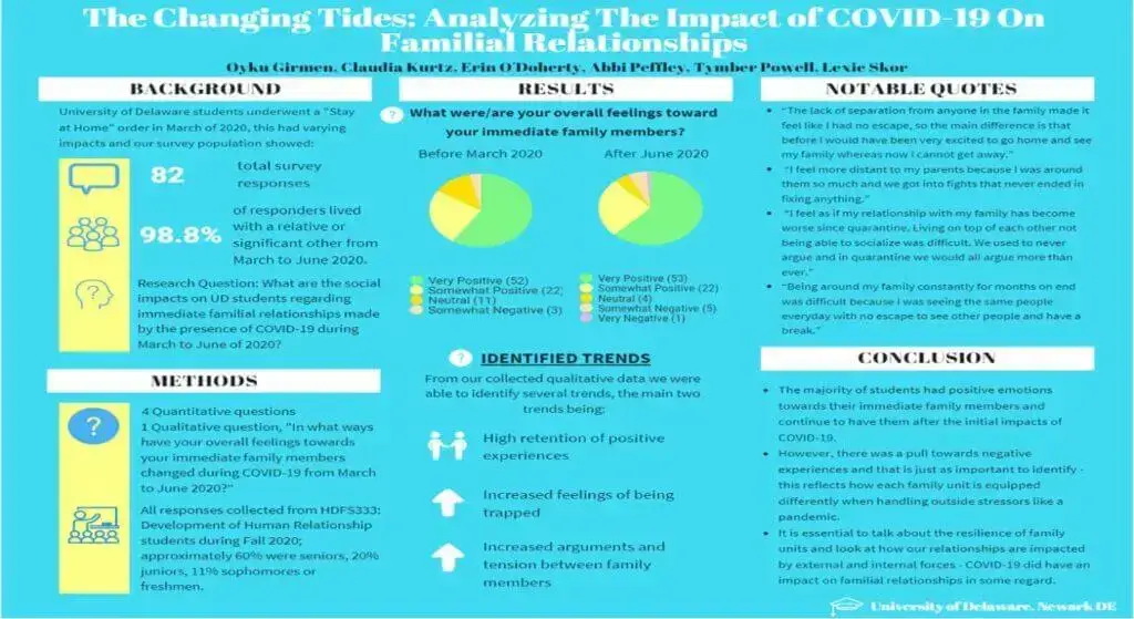
Even if you’re not invited to speak at your next scientific meeting, you still have a great opportunity to share your results and wow your fellow scientists at a poster session. A well-designed research poster that efficiently gets across your main ideas can make a difference between a lackluster showing and a standout appearance. In today’s post, we’ll go over some things to consider when making a research poster from content to organization to increasing visual appeal.
Cut Down on Text
The number one mistake of scientific posters is to pack in too much information. Even the most interested visitors to your poster are not prepared to stand for half an hour and read the entire thing. So, make it easy for them to get the gist. You don’t need to include all the information you would in a manuscript. And you don’t need to use full sentences. Instead, opt for bullet points. Justifying your text on the left side can help it be easier to read. And as always, a picture is worth a thousand words.
- Today, there are tons of dedicated tools that can help you create a custom poster from scratch, be it a scientific poster, wanted poster, advertising poster, etc. So, don’t be afraid to avail yourself of their templates to create your unique project.
Your figures are the heart and soul of your poster. Use them to your advantage and don’t bury them with large blocks of text that no one will actually bother to read. To help your viewers visualize important concepts, consider using diagrams instead of presenting walls of boring text.
Tell a Story

The structure is just as important to your poster as it is to any academic paper. Present your ideas in a logical order, with your poster facilitating this organization. Keep in mind that people naturally read from left to right and from top to bottom. One popular option is to split a horizontally oriented poster into three columns. Regardless of the pattern you choose, make sure it’s clear to readers where to start and end. To produce the best possible effect with your poster, you’ll want to include the following sections in your poster:
- Background. Provide your readers with the background information on the subject you aim to research.
- Objective. Clearly state what you want to achieve with your research.
- Method. Describe the novel tools and techniques you were using in the process of researching your subject. To save space, consider summarizing your project in a flow diagram.
- Results. In this section, you’ll present the main findings of your research in the form of graphs and result tables.
- Implication. Briefly, describe the implications of your study and mention how it can benefit your field or aid further research.
Let Your Creation ‘Breathe’
In designing your poster, don’t be afraid of white or negative space. If you fill every inch of your research poster, your creation will look cluttered and will hamper your readers’ ability to take in the most useful information. In fact, as much as 40 percent of your scientific poster should be blank. Remember to use this space strategically to draw attention to your most important messages.
Go for the Right Color Palette
It’s not a secret that color can liven up the overall look of your poster and thus influence the way your viewers perceive it. So, when it comes to choosing your color palette, be prudent and selective. It’s a good rule of thumb to use three to five colors and avoid ones that are too bright or printed poorly. Make sure to completely refrain from using patterns or dark colors for the background. This can be quite distracting, hard on your readers’ eyes, and also make your figures look bad and thus less credible. Also, keep your palette simple. White is the easiest to work with and the cheapest to print, of course.
Size Wisely
Even if your final product looks great and includes the right level of information, if the text is too small, it will annoy your visitors and drive away your audience. Therefore, you would be well advised to have everything easily visible from six feet away and nothing smaller than 24-point.
Don’t Go Crazy on the Font
Avoid using fonts that look ludicrous and unprofessional like Comic Sans. Also, do not include too many different fonts. It will give your poster a chaotic look. For your body text, it’s usually a good idea to opt for a Serif font. Those are the ones with the extra strokes at the end of the letters, like Times New Roman, which are easier to read when small. For titles and headings, pick non-Serif or Sans Serif fonts, such as Ariel or Helvetica.
Come up with Concise and Interesting Title
Short and sweet titles are usually better because many conference attendees scan the poster session titles to find the presentations they don’t want to miss. A good title that conveys your message and a well-written abstract can really draw people to your poster.
Re-Figure Your Figures
Don’t assume a cell where the figure can simply be slapped onto your poster. Figures should match the description or definition of the definition you’re trying to present. Simplify your graphs and provide titles and even arrows to help your readers along. Consider relabeling your images with more general descriptions so that scientists from outside your specific field will still get the basics of a given experiment. And summary figures can do wonders for giving passers-by the gist of your work. If it’s artfully done, they might even stick around to hear more.
Of course, remember to think about how to present your poster, as well. An attractive design will still fall flat if you get flustered trying to explain it. Master both, and you’re set to be a hit at your next poster session.


